


SQUERL UI Art & Design
Color

Color & Texture
Various color directions were explored with an emphasis on color theory and how visual choices could enhance the brand and user experience.
We ultimately chose a green-based palette that aligned well with the product's identity. The connection to nature—mirroring the squirrel in the logo—symbolizes the gathering of knowledge and information. The use of mint green offered a cool, fresh tone that felt like a refreshing take on how users engage with media.
For the CMS, the palette was intentionally muted to create a calming, soothing environment, recognizing that users might spend extended periods interacting with the interface.
Logo


Logo
The stakeholder had a clear vision for the logo style and asked me to explore concepts based on that direction. Given the name Squerl, I began by gathering reference images and experimenting with a range of abstractions and visual approaches.
While the original request leaned toward an abstract interpretation, the direction gradually evolved into a more realistic representation of a squirrel, better aligning with the brand's personality and intent.


Font
In parallel with the logo exploration, I also researched and tested various fonts that could reinforce the emerging brand identity. Each option was presented with consideration for the tone and feeling it conveyed.
We were particularly drawn to Semplicita Pro for its clean aesthetic and balance of sophistication and playfulness. It paired well with the logo direction and supported the approachable yet refined feel we were aiming for.
Final Logo Design
As part of my role I was also the UI Designer therefore took the UX designs through to full color deliverables. This work included the iconography, typography, logo design, color scheme and all the UI art.
UI Kit & Style Guide


Overview
The UI Kit and Style Guide were built in Figma as an interactive prototype, serving as a foundation for establishing the design system.
While it's still a work in progress, it provides a strong starting point for ensuring visual consistency and scalability across the product.
Navigational Elements
The app’s main navigation included a bottom navigation bar, along with an animated hexagon pop-out used for the “More” menu.
Colors
The color palette consisted of gradient ranges from dark to light within the established color schemes. Each color was labeled with its hex value and intended use to support consistency across the design system.
Buttons & Interactional Elements
This section included various elements from toggles to timelines, from drop downs to text inputs and everything in between.
Iconography
All iconography was custom-designed and paired with text labels, then organized by the screen where each icon appears. This structure make it easy to locate and reference icons quickly during design and development.
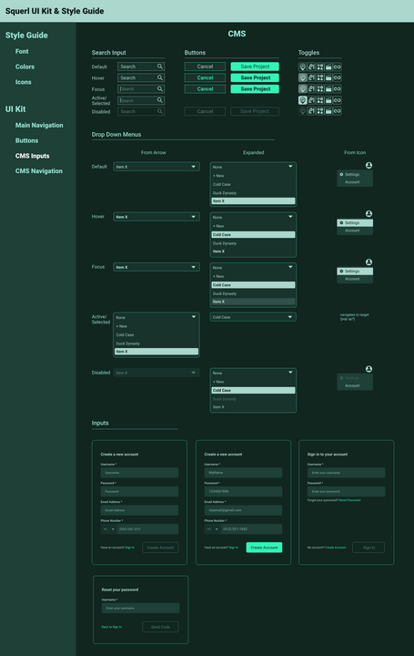
CMS Design Patterns
The CMS required distinct design patterns from those used in the mobile app. Each component was designed with all interactive states clearly documented to support accurate implementation.
CMS Navigational Elements
The CMS featured a side navigation bar, shown here with all its interactive states documented for clarity during implementation.
App Layout & Design


Layout & Design
Each screen in the mobile app featured distinct content, features, and functionality. Starting with a strong grid system, applying consistent patterns, and following mobile best practices helped establish a cohesive visual language and unified user experience across the app.
CMS Layout & Design


Layout & Design
The CMS, including Producer Mode, was also built on a solid grid structure. The goal wasn’t to reinvent the wheel, but to lean into established design patterns that users would already be familiar with. Flexibility was a key focus throughout. For example, the sidebar combined icons with labels to support both expanded and collapsed states, giving users more control over their workspace. Panels were also designed to be resizable, with the cursor changing to indicate draggable regions, allowing users to adjust layouts based on their needs.
Power Point Presentation


Pitch Deck
To maintain brand consistency, I applied the established color palette, typography, layout, grid, and design elements to the pitch deck.
The final template now serves as a foundation for future presentations, ensuring a cohesive visual identity across all communication materials.