


SQUERL mobile app
• content delivery companion •
Overview:
The Task
The core aspect of the product was the content delivery system, every other feature supported and expanded the user’s interaction with that content. Because of this, the delivery experience served as the foundation for the entire design. Ensuring it was well-structured and intuitive was critical to guiding the rest of the product’s UX.
The Challenges
We began this project without a clear vision of what the content delivery system should look like. Extracting that vision from the stakeholders was essential. While they had a strong conceptual direction, translating it into actionable requirements took time and careful collaboration.
The two primary stakeholders had different focuses. One owned the core product the app was meant to support, and the other was responsible for the app concept itself. Aligning their perspectives was critical to avoid unnecessary rework and ensure the success of the app.
As the product evolved, new information and requirements continued to surface. This made frequent iteration loops necessary to keep expectations aligned with the design process.
AI-driven functionality was introduced later in the project. This took the form of a presence that watched the show alongside the user, controlled the app, surfaced relevant content, and interacted directly with the user. Its addition required last-minute design adjustments to support this new behavior.
Impact
Delivered a fully designed mobile app PoC that clearly demonstrated the core value of the product, positioning the business to move into development and investor conversations with confidence.
Supported multi-phase development by delivering a PoC that represented the user journey clearly, even in the absence of back-end functionality or AI integration.
Aligned the mobile app’s visual language with branding, CMS, and marketing materials, ensuring a consistent end-to-end experience for users and stakeholders.
What didn't work
In the beginning, I received direction separately from the two key stakeholders, each with their own approach and priorities. Translating their input into actionable design often revealed misalignment. To solve this, we established a system where the aligned goals were funneled through one stakeholder, ensuring I received a clear and unified set of expectations for the project moving forward.
Lessons Learned
Having a clear understanding of each team member's role and expectations from the start helps prevent confusion and keeps collaboration on track.
The Accomplishments
The PoC phase of the project was a success. Clear goals, close collaboration, and iterative design from concept to implementation enabled us to deliver a solution that supported business objectives while addressing user needs, resulting in an intuitive usable app.
The live feed was designed to be the central focal point of the experience, with all other features built to support and enhance it. It successfully served as the foundation for guiding the user through their journey within the app.
We successfully navigated emerging expectations and shifting alignment by staying flexible, working iteratively, and applying a design thinking mindset throughout the process.
Design Process


Research
When I joined the project, my first priority was getting up to speed. I gathered requirements, conducted stakeholder interviews, performed product research, and documented goals and expectations.
Once all data was gathered, a high level summary of goals and design expectations was established to align the team and guide decision-making throughout development.
This groundwork helped clarify what we were building, why it mattered, and who it was for.
It was clear the first priority was defining the live feed feature and how it was supported and connected to all the other features.


Comparison:
Part of the research was to find apps that had features with functionality that was similar to what we were going to need to see how to approach designing for the core feature of the Squerl app which was the Live Feed.
Other core features within the app also went through this research step such as the gallery, settings, chat and so on.


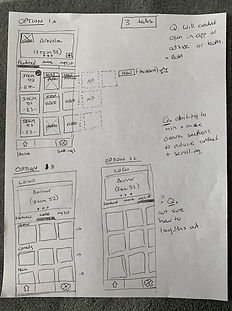
Sketches:
Rough sketches were created and discussed early on to quickly identify any misalignment. They served as a fast, low-effort way to validate my understanding of the vision and ensure it matched stakeholder expectations.
Sharing these in meetings surfaced valuable insights that helped us realign and move forward with clarity.
Bringing the live feed vision to life at this stage was critical and helped move us closer to designing the intended experience.


Ideate & Design: Early Explorations
This stage involved multiple rounds of iteration, which led to valuable insights that helped shape key features.
For the live feed specifically, we identified the need for a timeline with visual markers to indicate content deliveries. Additional considerations emerged around how sent items in the feed could transition into the gallery, helping define the relationship between features and guiding the overall user flow.
Prototypes
Various prototypes were set up and delivered to the team throughout the design process to test for feel and functionality. These help identify areas that were not feeling good or not working as expected.
Once a features had been implemented, we were able to test the build and iterate on feel and functionality by collaborating with the engineers.
For the live feed, we ended up adding an expanded and collapsed view. At first the user had control over this, but with internal testing, we found that it was an added improvement and a better experience if scrolling also triggered the functionality.


Ideate & Design: Color and Content
Hi-Fi Wires:
Once the core direction was clear and we had a solid design foundation, we began applying color and refining the visual style.
During this stage, new and evolving requirements began to surface. We had to revisit and iterate on existing flows to integrate features like "offers" and the "app assistant." These additions required new screens and interactions, but because the original design was built with scalability in mind, adapting to these changes was smooth and manageable.


Final Designs
As part of my role I was also the UI Designer therefore took the UX designs through to full color deliverables. This work included the iconography, typography, logo design, color scheme and all the UI art.

Implementation Review
Once all screens were delivered and implemented, I reviewed the build to check for any misalignment between the intended experience and the final product. Because of the close collaboration throughout the process, there were no major issues, only minor adjustments were needed mostly focused on placement and sizing.
I documented the feedback and shared it with the engineer. We then reviewed it together to clarify any questions and collaborate on solutions where needed.
Next Steps
Since this was a PoC project, the next steps after the business aspects are solidified, is to test with users to get feedback, iterate and refine the MVP.