


SQUERL CMS
• content management system •
Overview:
The Task
Design a content management system (CMS) to support the creation, management, and placement of content delivered to the mobile app. The system needed to accommodate multiple user roles, ranging from system administrators to content editors, each with different permissions and responsibilities.
Impact
Delivered a fully designed CMS interface that supported the core functionality of content management and content delivery setup, giving the team a clear visual blueprint for future development.
Reduced risk for future development by providing high-fidelity mockups and annotated wireframes that clearly communicated intended functionality, UI behavior, and layout logic.
Positioned the CMS to support investor presentations by visualizing the full content creation-to-delivery pipeline, even before development was complete.
The Challenges
The CMS needed to support two core features: a file system for organizing and managing a high volume of content, and a producer mode where content creators could define content delivery parameters for the mobile app.
Because the system was not intended to be fully implemented in this phase, workflows and edge cases were not deeply explored. The primary focus was to define the core functionality that would be coded and to provide a strong visual reference that aligned with business needs.
What didn't work
Initially, the file system and producer mode were planned as a single, unified feature. However, it quickly became clear that combining these functions created confusion and complexity for users. To resolve this, we split them into two distinct features within the system, allowing for clearer workflows and a more intuitive experience.
The Accomplishments
Defined the foundational structure of the CMS by separating file management and content delivery logic, setting up the product for clearer role-based workflows and long-term scalability.
Aligned functionality with business goals by translating high-level stakeholder vision into actionable design components that supported the core PoC use case.
Created high-fidelity mockups to communicate product direction, helping stakeholders validate priorities and supporting business discussions around future investment and roadmap planning.
Design Process


Research
Research for both the file structure and producer mode started with gathering requirements, interviewing stakeholders, and reviewing similar systems for reference.
Since producer mode wasn’t being implemented at this stage, the research there was intentionally limited. It wasn’t necessary to fully flesh out every detail, just enough to support the visual design and convey the intent for future development.
The flow diagram went through a few iterations before the logic felt solid and aligned with the overall goals.

Ideate & Design: Early Explorations
It wasn’t until the wireframe stage that the separation between the file system and producer mode became clear. Seeing the structure mapped out helped us recognize where the split needed to happen and why it improved clarity.
The first part of the user flow focused on starting a new project or opening an existing one. This step needed to come first so users could assign files to the correct project. With that foundation in place, we moved into design iterations for the file management portion, exploring layout, hierarchy, and interactions that would best support organizing large volumes of content.
Scalability was a top priority, as the system needed to support both a growing volume of content and future feature additions.


Ideate & Design: Hi-Fi
We moved into color explorations early, using the mobile app’s established color palette and design patterns as a foundation. This helped maintain visual continuity across both products.
Design iterations continued after color was applied, progressing in parallel with development. This approach allowed us to test functionality in context, refine the interface, and ensure consistency between the CMS and the mobile experience.
Prototypes
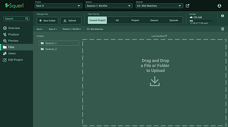
The image on the left shows the implemented file management interface we tested and validated during this phase. Since functionality was being iterated directly in the build, Figma prototypes were not necessary.


Ideate & Design: Color and Content
As additional iterations progressed, explorations around the color direction began to take shape. We stayed within the existing color scheme but opted to mute the palette, making it more suitable for a software environment where users might be interacting with the interface for extended periods of time.
Final Designs
Onboarding and File Importing:
As part of my role I was also the UI Designer therefore took the UX designs through to full color deliverables.
The top section of images to the left show onboarding new users and setting up a project.


These bottom images to the left show the file management feature and the different views they can be set to.
Some aspects of the feature in these images include: importing files via drag and drop, user profile, history of content interactions, and file info.


Producer Mode:
As mentioned earlier, Producer Mode was limited to UI design only and was not implemented during this phase.
This feature required more on-screen options and controls, which made visual hierarchy and clear organization critical. To prevent the interface from feeling overwhelming, we focused on intuitive grouping, clear labeling, and thoughtful layout.
Flexibility was also a key consideration. Features like a collapsible side menu, resizable windows, and an expandable timeline were included to give users greater control over their workspace and tailor the interface to their needs.
Next Steps
As we move into the next phase of development, the focus will include:
-
Ensuring compliance with Web Content Accessibility Guidelines (WCAG)
-
Integrating user-facing AI support once requirements are defined
-
Expanding and refining all use cases to complete the remaining feature design
-
Conducting usability testing to validate design assumptions and improve overall experience