Gears Studio - Desktop App
Gears Studio was originally built as an internal tool to help developers organize and streamline component-based development. It became the standard application used across in-house teams for building our customer-facing products. Our team was tasked with evolving Gears Studio into a customer-facing desktop application, packaging it as part of the SDK to be delivered to external developers.
Gears Studio: Project Overview
My Role:
Senior UX Designer
Team:
Team Size: 5
PO/BE Developer
2 BE Developers
QA
UX designer
Duration:
4 months
Deliverables:
I was responsible for Stake holder/SME/User interviews, Use Cases, Flow Diagram, Research, Wireframes, Prototypes, UI Kit and Style Guide, Usability Testing, Iconography, Personas, and Final UI design.
Process:
Discovery
Research
Interviews
Existing user issues
Evaluation of product
Company expectations
Define
Use cases
Users
Flow diagram
Personas
Ideate
Sketches
Wireframes
Brainstorming
Prototypes
User testing
Design
Final Design & Launch
Mock ups
Visual Design
UI Kit / Style Guide
User testing
Final design docs
UX/UI Review
Tools:


Challenges:
The project was expected in such a short time frame that during each sprint planning the team had to make difficult decisions about which features were most important and which ones could be implemented successfully. We had to continuously adjust the designs to accommodate development changes.
Working with such a small and highly organized team made the UX pipeline integration during the development process very fluid rather than a clearly defined process. It often came down to quick check-ins like, “I just implemented this design—can you review it before I send it to QA?”
The product required a full redesign since the existing version had been designed by developers and was not streamlined or user-friendly. We also needed to reduce features to meet the release date.
One of my biggest challenges was simply understanding what the product was used for, how it fit into workflows, and how each user persona would interact with it. As a developer tool replacing certain steps in component-based development, it was inherently complex, time-consuming, and tedious.
Finally, Gears Studio was a new and unique product with no direct competition, which meant competitive research was not an option.
Lessons learned:
On this project, I leaned heavily on developer expertise, which helped me ramp up quickly. Since the developers were also one of the user personas, they began to see themselves as end-user experts and drove parts of the design based on their own preferences. This overlooked how other internal teams and external customers might use the app differently, and ultimately led to several design assets needing to be revisited after implementation.
What didn't work:
We chose a card-based system to display component information, which user testing supported as a viable design direction. However, once released, one internal team with a very large number of components found the design impractical. It required excessive scrolling and prevented them from getting an overview of all components at once. To address this, we designed a compact card view that users could toggle on and off.
Accomplishments:
After the success of the License Manager, leadership recognized the value of having UX embedded in the process and requested a dedicated designer for this product as well. The work on Gears Studio additionally continued to change how the company approached UX design.
I introduced a more modern design style that not only refreshed the visual appearance but also improved usability, making the product feel more polished and professional. This helped elevate Gears Studio from an internal tool to something that could be delivered externally as part of the SDK.
Along the way, I gained a deeper understanding of the company’s development process, which strengthened how I collaborated with engineers and helped me design solutions that aligned more closely with technical realities.
Gears Studio: Research & Discovery
Research existing product version:
I explored the application on my own to see if I could figure out how to use it, but I was not successful. There was no clear path, which was common in many of the company’s products due to the nature of the industry. To better understand it, I relied on documentation and conducted extensive interviews with stakeholders and the various internal users who interacted with the product.
This design caused users to rely too heavily on external documentation or on asking coworkers for help while using the product.
I created a site map and workflow chart of the current version to better understand the complexities of its use.

Sketches:
Sketches of the product work flows for current implementation and exploration for new direction.

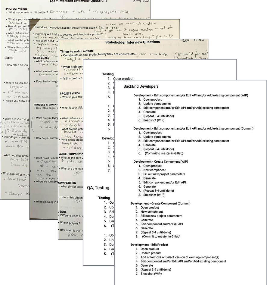
Interviews with SMEs:
Interviews with users:
I conducted interviews and conversations with subject matter experts, including the PO (who was also the project lead) and two upper-level directors.
Through these interviews, I gathered information about the program, clarified the business requirements, and developed a stronger understanding of the different ways the application was being used.
I began by interviewing my own team to gain a deeper understanding of the product, since they had created it and knew the most about its functionality. This gave me the context I needed to better understand feedback from other users in the company.
User interviews were then conducted both locally and with users from other BISim locations worldwide. My goal was to document whether usage varied by location or by product. I found that variations existed per product and per user, but not significantly by location.

I created documentation of the interviews and a results report to compare user and stakeholder needs against the features that were actually implemented in the product.
Gears Studio: Define
Use Cases:
After interviewing various internal and external users, the personas and use cases began to take shape. Three main features were utilized across all users, though they were not always used in the same way, nor were all features relevant to every user.
The primary functions identified were documented as formal use cases, with samples of this documentation shown below.
Feature
Use case
API
Components
Products
• Create a new API
• Edit an API
• Create a new component - handle dependencies, create snapshot.
• Edit and existing component - handle dependencies, create snapshot.
• Update components ( binaries only, not source)
• Create a new product
• Edit a product, edit component, update a product ( version switching )
• Update and launch a product ( only thing QA, UX designers and BD’s used GS for)
Users:
From the interviews, several user types emerged that could be classified into three main categories:
-
Back-End / Front-End Developers
-
Technical Designers
-
Other (UX Designers, QA, Business Developers)
Front-end and back-end developers had similar use cases, while the “Other” group interacted with the product in a very different way, focusing more on updating and launching a product rather than developing components. Technical designers shared aspects of both groups.
Ultimately, we had two main user groups to consider, each with different needs. Internal developers were power users who wanted maximum productivity and efficiency from the product. External developers, on the other hand, would be new to the tool. Their primary goal was to add functionality and features specific to their training needs, making this their first exposure to an external release of the product.
Users
-
BiSims employees: backend developers, technical designers, UX designers, business developers, and QA. Each group had different reasons for using Gears Studio.
-
External customers: primarily backend developers using the product to build special features required for their training scenarios. Much of this work was ITAR-restricted and not developed in-house.
Because we did not have direct access to external end users, all research data came from internal teams. After gathering enough insights through interviews, I created the user personas we would target. For the initial launch, we focused only on backend developers, as the other personas were not part of the MVP and their specific needs were deferred.
Future releases were planned to address the additional personas and features in the backlog.

I added a touch of humor to the personas and data so the team would feel more personally engaged, which helped promote and increase acceptance of the UX process within the company.
Flow Chart:
Because this product was complex in how it was used by developers, I created a flow chart of the basic functionality to illustrate the different navigation paths available. While developers already understood their workflows, this asset proved especially valuable for stakeholders and other team members who needed a clearer picture of how the product was used.

Gears Studio: Ideation
Brainstorming:
Brainstorming sessions were held with the team to explore page layout designs and the component visualization.

Card Sort:
A card sort was conducted to determine the information architecture to be used.

Sketches:

Many design ideas were explored and reviewed with the team. Once the most promising directions were identified, we moved forward with creating low-fidelity wireframes.
Wireframes:

Font sizes, icon sizes, sizing placement of elements, and many other aspects were explored and refined.
Once the ideas were mocked up into a digital format, review and design meetings were held. We discussed and explored options and made adjustments to the placement and layouts of the various features within the product.
High Fidelity Wireframes:
Iterations were being continuously made based upon team decisions, user testing and stakeholder feedback. Here is an example of the stages the start page went through.

Gears Studio: Prototype & User Testing
Prototype - High fidelity:
A full color prototype was created for the whole product. This was necessary so we could have the entire workflow functioning to evaluate if users could navigate through the entire application.
Once the prototype was completed, test scenarios were created to focus the users on specific tasks. The users would then need to navigate through the application to complete the tasks successfully.

User Testing:
Because I relied heavily on the team to help me understand the product from a developer’s perspective, some design decisions were initially driven by their input. User testing revealed that while the team represented the intended user group, their solutions did not always make the product user-friendly for others outside the team.
Multiple testing sessions were conducted throughout development, including:
-
A/B testing
-
Click testing
-
Individual in-person sessions (both local and remote)
A/B and click testing were used to validate the clarity of asset placement and messaging. Some results confirmed our assumptions, while others showed we were off track. In those cases, we developed new solutions and retested until the design aligned with users’ mental models.
User testing was conducted on both the XD prototypes and the beta builds. We used XD prototypes early to validate the overall approach before development began, ensuring the product could be understood by users. Testing was carried out every sprint since the product was developed in chunks. Each feature was first tested in prototype form, then retested in beta once it reached a testable state.
Testing Insights
Some of the key findings from user testing included:
-
Users struggled to navigate back to the Start page.
-
The switch component version button was difficult to find.
-
The add/create new component button was also difficult to locate.
-
The API error notification that locked page editing was not noticeable enough, causing users to get stuck.
-
Users did not realize that component cards contained additional output details accessible via the expand arrow.
Click Testing

In Person User Testing

Gears Studio: Design
Style Guide, Iconography, IU Kit:
Designing the UI for Gear Studio was made much simpler by the standards put in place for external products. These standards were enacted when License Manager was developed. Now all external products were going to have a consistence design style.
New icons are designed along with the final highlight color and its variants. The product logo was also updated. The UI Kit displayed below is only a portion of the entire document that was created.


Gears Studio: Develop & Launch
Final Design:
Here is the final design for the Gears Studio application with the implemented features. The design and finished product were well received by both the company and internal developers.
Feedback:
Internal user feedback was collected after release, and many in-house developers raised complaints. Because the product was being prepared for external release, some features they were accustomed to had been removed. To manage this, the team set up a backlog where users could submit concerns. Over the following year, many of the removed features were reintroduced to support internal workflows.
In parallel, rounds of bug fixes and improvements were released. By the end of this cycle, all major needs of internal developers had been addressed, and the product became fully usable by both internal and external users.


